pablo

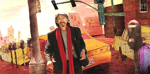
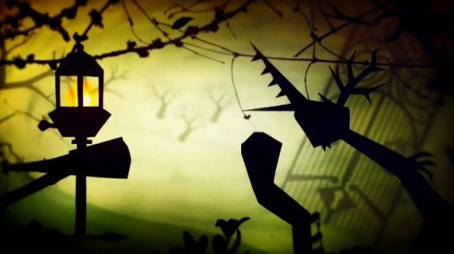
The feature length biopic, Pablo, directed by Richard Goldgewicht is a brilliant initiative both in its subject matter as its approach. I’m really looking forward to seeing this film. It is planned for 2010 but here is the all new trailer to whet your appetites.

>>> WATCH HERE

myronKrueger
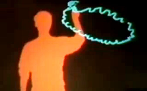
Stills from Myron Krueger’s Videoplace, 1969-1975.

Two links that I have wanted to post for a long time. Golan Levin’s essay on Computer Vision for Artists and Designers: Pedagogical Tools Novice Programmers. And Myron Krueger’s Video Place and Responsive Environment.

Excerpt from Levin’s essay:
This paper attempts to demystify computer vision for novice programmers, emphasizing the use of vision-based detection and tracking techniques in the interactive media arts. The first section of this article introduces some of the ways in which computer vision has found artistic applications outside of industrial and military research. Section II, Elementary Computer Vision Techniques, presents an overview of several basic but widely-used vision algorithms, with example code included in appendices at the end of the article.

>>> READ HERE COMPUTER VISION
>>>THEN WATCH HERE MYRON KRUEGER

oceans_01

There are a plethora of websites out there that showcase Saul Bass’ work; the ubiquitous You Tube retrospectives and collections of the like that all hail him as the master but which all seem as drab in their presentation and their commentary as the rest. In times like these where much information has become a thoughtless action of copy-pasted text and image, there still remains copious room for writing about Bass and indeed there should be more insight, as few have indeed done, into titles, its history and its revival amongst contemporary motion designers. The link with this early form of motion design is evidently strong and has become a rich source of inspiration for today’s practitioners. Beyond the staple quality of work that comes from a handful of studios such as Prologue and Imaginary Forces there is a younger generation whom have a deep yearning to create the next enthralling title, whether it be for the epic, the festival, the happening or even the book. (Book titles are coming you know, they are an emerging form).

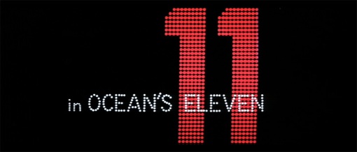
To continue with Bass, it seems appropriate to pull out the bag one of his least talked about, yet on a personal note, one of his most beautiful and accomplished of works in the realm of pure motion graphics. Ocean’s Eleven was, like the opening titles for Seven by Kyle Cooper, an example of how the title gained more in appeal than the film itself. Despite its star cast ‘brat pack’, it was a complete flop and we can safely say that the contemporary revamp was a clear winner. Saul Bass however had managed to create a masterpiece of modern title design, one that serves as the paradigm of what he claimed is a necessity of the form: to set the scene, express a certain ambiance for the viewer and give a glimpse of the story to unfold. He achieves that with a graphic language of utmost simplicity yet of striking force.

Set in the city of Las Vegas amidst the lights, casinos and its omnipresent gambling paraphernalia, Bass counts his characters in before setting off into a colourful play on form and precise layout. We get the cards, the tables, the dice, the machines, all intertwined with the palace lit setting of money, love and the quest for it all. Bass had left nothing to chance right down to creating a perfect symbiosis of imagery and sound with the brilliant musical score by Nelson Riddle. It is the musical leitmotiv in the opening sequence that serve as character description. You have the cool, the bad guy, the sexy woman, the lover, the man of pride, they are perfectly placed and perfectly timed with a timeless classic of pure motion graphics.

>>> Good Quality Copy to View Here

nhktokyo

It’s those lazy Sunday afternoon strolls that are at times most fruitful. Especially when one takes the pleasure of perusing amongst the dust and tatter of back-alley second hand book shops. Two rare gems caught my eye on this particular occasion: Graphic Design in Education Television (Beverley Clarke, Lund Humphries London 1974) A short yet precise introduction to understanding the techniques for broadcast design and in particular, educational television. Although a lot of its contents are today redundant, the book is testament to the state of graphic design in early television production. Clarke drives forward her claim for “The importance of graphic design for educational television…..(which) surprisingly has rarely been discussed.” She continues, “This is clearly an omission in a rapidly expanding profession.” Her claim is a bold stance to take for the time, graphic designers receiving little credit for their work in this domain, but foresaw a definite rise in the role of the designer and many educational programs.

Television in the 1960’s and 70’s was considered as an important medium for extending educational curriculum in schools. One of the better known instructional systems in the UK was the Open University which started transmission in 1971 and was an educational partnership with the BBC. The graphic design unit grew out of the parent department of the BBC creating a shift from presentational graphic work to informational graphics.

Interestingly, we have seen a rise in ‘information graphics’ on the Web in the past five years. Melhil Bilgil’s diploma work, ‘History of the Internet’ being one of the latest fine examples of how graphics can inform. Andrew Vande Moere’s superb website, Information Aesthetics documents this trend.

halas

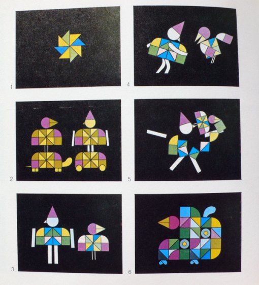
The second book to pop out from the shelves was The Technique of Film Animation (John Halas & Roger Manvell, Focal Press 1959). John Halas wrote incessantly about all aspects of animation and always with the intelligence that the finer realms of this medium demand. What is striking about this collaboration with Manvell, considered as the authoritative source book for its time, is the scope of animation they manage to present. Whole chapters are devoted to commercial work, public relations, propaganda, avant-garde, instructional and educational animation. Indeed, Halas went on to publish a complete book entitled Film & TV Graphics, a comprehensive survey of graphics in the domain from around the world.

>>> More links on Information Design

larson
© Gary Larson

07: “I’m a professional: I know best.” The only designers who use this argument are unprofessional designers. Designers often say, “No one tells a doctor what to do, so why is it OK to tell me what to do?” But the myth of professional omnipotence has been debunked. We no longer accept that doctors, lawyers and plumbers have a monopoly on knowledge. Speak to any doctor and they will tell you that people come into their consulting rooms armed with information downloaded from the internet. We have long since learned to question and challenge expert opinion. Why should designers be exempt? Anyone who uses the “I’m a professional therefore you must accept what I say” argument has lost the argument.

>>> Read Full Article Here

digitalkitchen
Seattle International Film Festival. © Digital Kitchen 2009

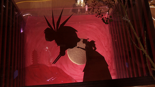
I was pleasantly surprised to come across this beautiful piece by Digital Kitchen, Seattle International Film Festival 2009. Not for its intentional reference to and inspiration from Lotte Reiniger’s work, rather it is the technique that grabbed my attention.

For the production of The Adventures of Prince Achmed, Lotte Reiniger, Carl Koch, Walter Ruttmann and Berthold Bartosch had developed a special multi-plane animation table built from a wooden frame that held a number of glass frames at different levels from the camera. (A technique often and wrongly associated with Disney as the pioneer.) Using various layers and playing with the distance from the camera, a wonderful effect of depth could be created within a scene. The multi plane also enabled many special compositing effects, Bartosch being the specialist in this domain, using sand, soap and other materials to create varying textures and light diffusion effects. These helped in intensifying the magical quality of the scenes as well as in developing starry skies, magnificent sea journeys and dream-like scapes.

siff-production-still
Production Still © Digital Kitchen 2009

It is clear that Digital Kitchen used the exact same multi-plane technique in creating the festival teaser. No soap or sand seems to have been introduced but they had used a diffuser layer of glass as part of their process. What I find surprising then, is that they actually did this in a time when AE would have reproduced a similar, albeit less attractive, effect. I have no recollection of contemporary animators using this technique, nor do I believe it has been reproduced since Reiniger’s creation on such a faithful scale. The results, of what must have been quite a painstaking procedure, clearly demonstrate a beautiful piece and one that perhaps nods to a gaining interest for more analog work.

>>> Insightful post on the making of here
>>> The Art of Lotte Reiniger – A short documentary

We tend to think the tiger represents the animal kingdom, but in truth, a grasshopper is a truer statistical example of an animal. The handcrafted Hollywood film won’t go away, but if we want to see the future of motion pictures, we need to study the swarming food chain below — YouTube, indie films, TV serials and insect-scale lip-sync mashups — and not just the tiny apex of tigers. The bottom is where the action is, and where screen literacy originates.

>>> Read full article.

mclaren_visitcanada
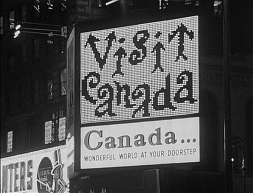
New York Lightboard Piece © Nation Film Board of Canada

The National Film Board of Canada was commissioned by the Canadian tourist board to create a film that would entice Americans to travel to Canada. The work was taken on by Norman McLaren who made a nine minute silent film using black india ink on clear white film stock. It was shown on the giant billboard in New York’s Times Square in 1961. The completed film is a purely informational work, communicating clearly the many cultural sides to Canada as well as illustrating each major city’s main attractions. It is simple in form yet the animations are absolutely stunning, even by today’s standards, using a number of typographic compositions that metamorphose into an array of graphic shapes. McLaren’s playfulness really comes through and his mastery of morphing shapes, a trait that runs through much of his work, act as effective transitions, creating a seamless animation that had many a New Yorker stop in his
his stride.

>>> Watch a selection of Norman McLaren’s works here

3198823976_7a63e2d26e
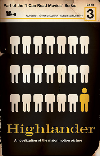
© Spacesick Publishing 1964

A nice selection of book cover designs from Spacesick’s “I Can Read Movies” series.
>>> HERE

In Response to Reading David O’Reilly’s ‘So What Do You Do?’

There are obvious advantages to being the director; instant recognition, that ‘ooh’ factor at cocktail party presentations, credentials that evoke glamor and prestige, hovering in the realms of the halls of fame. The director is historically linked with the epic, the cinematic, it is a title that beholds a certain grandeur, one of the major 20th century artists. The reality however for many so called ‘directors’ today reveals a rather more sober perspective. Convention amongst many of the motion design studios and freelancers to mushroom point towards a completely different and perhaps milder more diluted role and indeed to the extent that the term director has become a title for the one man show.

Anyone can ‘take on the role’ of a whole production company these days – we all have the possibility to change our professional caps every 30 minutes of the day. There are considerable examples of quality work that rises from out of the blue screen bedroom studios where a single talent can write, design, film, animate, composite, mix and broadcast their work. Wearing these multiple caps however does not necessarily qualify oneself within the field. The term director, as O’Reilly points out ‘is such an umbrella term, it ceases to describe anything meaningful’. Walk through the corridors of a number of ’boutique’ studio set ups these days and practically everyone you meet is a director. Doesn’t the fact that many commercial projects today find their direction through a sole creative force and approach make us question the use of the title director? It may be a customary convention but isn’t it misleading?

So what do you do? There certainly is a need to think carefully about one’s professional title and have the sincerity to attribute the correct one. Which one? In the domain of motion design where motion (graphic) designer seems to have been dropped for the more esteemed director, I’d like to see a rectification. Your job title is perhaps but a general term but it can only have the weight of meaning via collective understanding of what that title entails. When I have back ache, I may go to see the osteopath but not the dentist or hematologist. If I’m not aware of that information, I can’t respond correctly. If we take on professional titles in a lax manner, we dilute and ultimately denigrate professions. It is not a simple choice of giving oneself a name, it is a conscious and sincere effort of working within a line of work and ultimately respecting your position and experience, whether you be artist, designer, editor, props man, BG layout man, animator, foley artist, in-betweener, chief animator, first assistant director, 3D modeler, ……

>>> Read David O’Reilly’s ‘What Do You Do?’